


Make a Duotone Photo
Shadows become one color, highlights another — the bold two-tone look from posters, album covers and brand campaigns.


More image effects
All effects
Duotone Effect — how it works
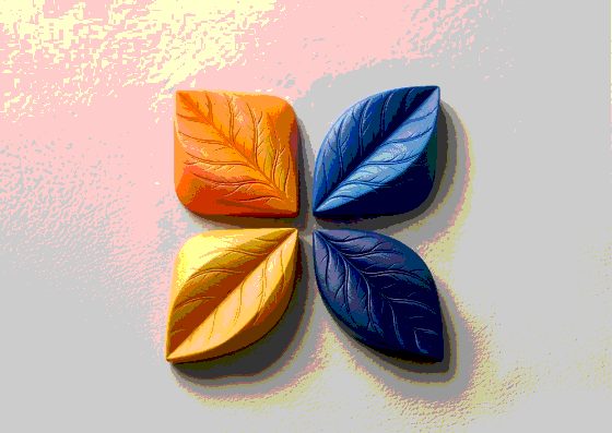
Map a photo onto two colors — the Spotify-style duotone look.
How duotone works
The photo is converted to brightness, then every brightness level is mapped onto a gradient between two colors: the darkest pixels take the shadow color, the brightest the highlight color, everything else a blend. Detail and contrast stay; the palette becomes entirely yours.
Picking colors that work
Duotones read best with a dark, saturated shadow color and a light, bright highlight — navy and pink, ink and lime, purple and orange. Two colors of similar lightness flatten the image. The Heat preset adds a third color in the middle for a tritone.
Where to use it
Duotone photos unify mismatched images in one brand palette, make text on top of photos easier to read and look great on posters, covers, hero sections and social templates.
Frequently Asked Questions
Yes — type or pick any hex color for shadows and highlights.
Open the image in Image Flow: its Gradient Map effect lets you add any number of color stops.
No, the effect runs in your browser.